Here's a list of a few games I've worked on over the years. I'm still going back into this catalog and constantly adding the visuals to this site. Subsribe to my newsletter here if you want to keep up to date.
Notable games I've worked on:
POX electronic game of Global Domination 2001
M.A.G.S - Music Activated Game System
Parcheesi refresh 2003
Hangman 2003
PayDay refresh 2000
Aggravation refresh 2003
Sorry Refresh 2002
Sorry Sliders
Sorry Revenge Electronic Card Game
Heroscape (before WOTC takeover)
Battleball
Monopoly 70th Anniversary
Risk 2210 (wide box original release)
Risk Black Ops
Risk Legacy
Tonka Pop-O-Matic Search & Rescue Game
Vampire Hunter
Magnami
Catch Phrase Junior
Mission Command games 2002
Stratego Fire & Ice (2008)
Risk Star Wars (2015)
Star Wars Monopoly (2015) logo treatment only
Bop It (line refresh 2009)
Bop It Beatz 2014
Flash Electronic Games 2011
Marvel Super Hero Squad Games
Nemesis Factor
Transformers Battle Masters
Guess Who refresh
Star Wars Galactic Heroes board game series
Stop Thief! (2017)
Downforce
Indulgence
Shifting Realms
Fireball Island, The Curse of VulKar and all expansions (2018)
Downforce Danger Circuit Expansion (2018)
Dinosaur Tea Party
Conspiracy, The Solomon Gambit
Unmatched (all titles)
Downforce Wild Ride Expansion (2019)
Stop Thief! 2nd Edition (2019)
Fidget Factory
Return to Dark Tower
And probably more that I forgot about. ;)
A restoration of the classic 80’s board game…
MORE ON THIS PROJECT HERE
I’m currently developing the visual creative direction, art direction, and graphic design for this one.
Unmatched; In battle, there are no equals
The restoration of the 1970s game, Conspiracy.
The classic 80's game of marble mayhem is back and better than ever.
The Fireball Island restoration was a great challenge and a blast to work on. I was lead visual creative on every aspect, from early marketing efforts, to final graphics and illustration of the gameboard.
You can even check out a fast forward process video of some to the illustration in progress.
Two new tracks and six new powers to turbocharge your game of Downforce.
This new expansion for Downforce needed to turn the danger dial up. So I decided to make art direction and color scheme more intense, focusing on a more black and yellow color scheme with influences from the night-time and rocky tracks.
Downforce is the restoration of Wolfgang Kramer’s classic. For nearly 40 years, this card-driven racing game has been the delight of gamers and families. Known by many names –
Top Race, Daytona 500, Cleveland Grand Prix – Now restored as DOWNFORCE.
With this restoration gameplay was updated while the art and design are completely redesigned. I enlisted the help of Tavis Coburn for cover art and character illustration and Michael Crampton for gameboard illustration. The result was something reminiscent of the old versions of the old games yet powerfully unique in its own right.
Every game deserves another turn. Such a great idea... find games out of print from the 70's, 80's and 90's and restore them with modern gameplay and graphic improvements. The startup company, Restoration Games approached JTD with a challenge, create an ID that reflects this story and brand succinctly and concisely.
They say a good logo should work well small, in black and white, and shouldn't rely heavily on textures and illustration...
Well this isn't your typical logo, it's a 'kick-you-in-the-face-and-crack-open-the-gates-of-valhalla' logo!
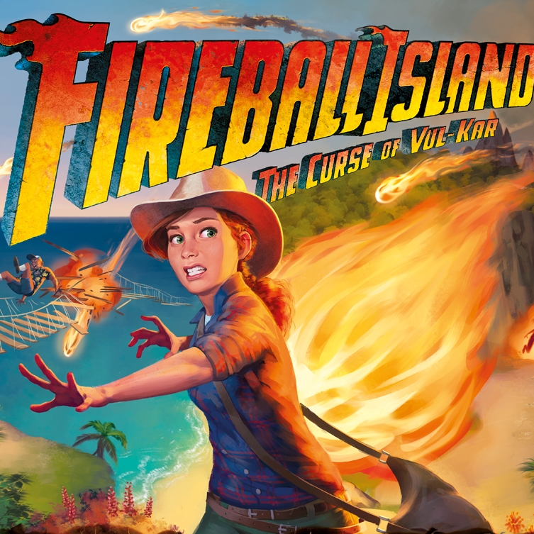
Responsible for: Package graphics, all content graphics, iconography, logos and identity.
I had the pleasure of working on the branding and contents for this exciting new and innovative game from Rob Daviau and Hasbro. This is a game where decisions the players make in one game will affect every game thereafter. Here is a little more explanation from the game designer, supah genius, Rob Daviau:
There are no do overs in life. Some decisions just make you who you are.
This led us to wondering why games always have to reset. Why are they a medium that always goes back to start? Movies and books are static forms of entertainment meant to be viewed but not altered. Games, by nature, demand that the user create the experience. We wanted to push that boundary to have lasting effects. Now you really create the experience. This game is not art to be hung on a wall but a leather jacket to be worn around until it has its own unique story.
It is one thing to play a card in a game to gain an advantage. It is entirely different to play a card and then rip it up, banning it from the game forever (I know that none of you will actually rip it up). Or to mark a territory that will change its destiny from here on out. It's a different decision process. How important is that card now? Will it be more important in a future game? Will you have it then? Is this the time? Is it worth it?
You can take a closer look at the instruction booklet here. Which by the way, I also designed.
Oh and those awesome concept and cover spot illustrations were done by concept artgods, Massive Black.
Brand development and Packaging line for Heroscape, a strategy game with a unique buildable gameboard made up of interlocking hex pieces.
I also developed the unique shaped game cards. These game cards carried the theme of the hex and could fit within a 7-hex gamepiece.
At the bottom is a concept for booster packaging which used a large buildable gamepeice as the package.
Check out the never-before-seen alternate box covers further down.
This was one of the more challenging games I've worked on. This game was all based on the theory of blue and red lights cancelling out ink on the game pieces... but we still had to prove it could work. After countless trials of inks and lights... IT WORKED!
The other challenge with this game was much more frustrating. During the time of this game there were some marketing changes with drastically different points of view on who the target market was for this game. Because of this, the art suffered some. While the quality of art is there, the continuity is not... that's because I spent most of our time and budget on four different final boxes. Yes, FOUR! And unfortunately my least favorite was the one we went with. It was pushed in a much campier directions for the cover.
So I'm sharing those alternate box covers further down the page.
Brand development and Packaging line for Heroscape, a strategy game with a unique buildable gameboard made up of interlocking hex pieces.
This was my introduction to working with game designers, Rob Daviau and Craig VanNess. A nuclear blast to work on. I don't know how many times we playtested this, but I can confidently say I made sure to go to the moon every game. I'm pretty sure that's what earned me my very own exclusive Space Command card.